
box-sizing 屬性
盒模型(box modal)
先畫一下盒模型的圖

從這張圖可以看出來盒模型由內到外有四層,那通常在 css 的屬性可以設定寬高,那麼寬高是指哪裡呢?事實上,有一個屬性叫做 box-sizing,在這邊我們來看看把 box-sizing 調整成不同的屬性會發生甚麼事。
content-box
.box {
    box-sizing: content-box;
    height: 100px;
    width: 100px;
    padding: 5px;
    border: 5px;
}
那結果會像下面這張圖:

border-box
.box {
    box-sizing: border-box;
    height: 100px;
    width: 100px;
    padding: 5px;
    border: 5px;
}
那結果會像下面這張圖:

總結
- content-box 的寬高設定是 content 的寬高,所以可以想像成 padding 以及 border 是往外延伸的。
- border-box 的寬高設定是包含到 border 以及 padding 的寬高,所以可以想像成 padding 以及 border 是往內延伸的。
- 無論是 content-box 或是 border-box,margin 都是往外延伸的。
- background 指的是 content 加上 padding 的範圍,無關乎是哪種 box-sizing 模式。
- 用 border-box 較於方便管理整個元素的大小。
補充 - outline 與 border 有甚麼不一樣?
outline 在 input 元素被 focus 瀏覽器預設會加上 outline。比如說 google drive 的登入框在滑鼠點擊時就會出現藍色的 outline。

outline 除了在用途跟 border 不一樣以外,性質也不同,outline 是跳脫排板流的,也就是說 outline 並不占空間,不會因為 outline 的出現而去推擠到其他元素。但是 border 則會推擠到周邊的元素。
display 屬性
display 屬性有三種,接下來會一一介紹。
block
block 的代表有 h1 ~ h6、div。首先要知道的是 block 的元素一個會佔一整行,準確地說,雖然一個 block 元素的寬度通常沒有一整行這麼長,但下一個元素會從下一行開始填充。
<!Doctype HTML>
<head>
    <meta charset='utf-8' />
    <title>block</title>
    <link rel="stylesheet" href="./block.css" />
</head>
<body class="debug">
    <div class="first block">
        first line
    </div>
    <div class="second block">
        second line
    </div>
    <div class="third block">
        third line
    </div>
</body>
/* css */
html {
    font-size: 36px;
}
html, body {
    width: 100%;
    height: 100%;
}
html, body, h1, h2, h3, h4, p {
    padding:  0;
    margin:  0;
}
.block {
    border: 5px solid gold;
    height: 150px;
    width: 300px;
    padding: 20px;
    margin: 50px;
}
.first {
    background: red;
}
.second {
    background: green;
}
.third {
    background: blue;
}
呈現出來的樣子:

稍微整理一下:
- 一個 block 元素無論寬高下一個元素都從下一列開始排。
- block 元素很乖,無論設 padding 或是 margin 都可以拉開元素間的距離。
inline
block 的代表有 span、a。首先要知道的是 inline 的元素不會改變自己的上下位置。
<!Doctype HTML>
<head>
    <meta charset='utf-8' />
    <title>inline</title>
    <link rel="stylesheet" href="./inline.css" />
</head>
<body class="debug">
    <div class="first inline">
        first line
    </div>
    <div class="second inline">
        second line
    </div>
    <div class="third inline">
        third line
    </div>
    <div class="div">
        other content
    </div>
</body>
/* css */
html {
    font-size: 36px;
}
html, body {
    width: 100%;
    height: 100%;
}
html, body, h1, h2, h3, h4, p {
    padding:  0;
    margin:  0;
}
.inline {
    display: inline;
    border: 5px solid gold;
    height: 150px;
    width: 300px;
    margin: 50px;
    padding: 50px;
}
.first {
    background: red;
}
.second {
    background: green;
}
.third {
    background: blue;
}
呈現出來的樣子:

稍微整理一下:
- 一個 inline 元素無論寬高如何調整,寬高都是被內容撐開的大小。
- inline 元素比較傲嬌,無論設 padding 或是 margin 都只可以拉開左右元素間的距離,設上下的 padding 雖然有效果但不會影響到上下層元素的排版。
- 總之 inline 元素的內容只會左右動不會上下動。
- inline 元素是可以水平填充的,這一點跟 block 不同。
- 通常 span 還有 a 標籤都是在一段文字裡去加強某一段文字的效果,想想看如果 span 或 a 標籤的文字把上下行的文字都擠開了,那排版會大崩潰。
inline-block
inline-block 融合了 block 及 inline 兩者的特長,一起來看看。
<!Doctype HTML>
<head>
    <meta charset='utf-8' />
    <title>inline-block</title>
    <link rel="stylesheet" href="./inline-block.css" />
</head>
<body class="debug">
    <div class="first inline-block">
        first line
    </div>
    <div class="second inline-block">
        second line
    </div>
    <div class="third inline-block">
        third line
    </div>
    <div class="div">
        other content
    </div>
</body>
/* css */
html {
    font-size: 36px;
}
html, body {
    width: 100%;
    height: 100%;
}
html, body, h1, h2, h3, h4, p {
    padding:  0;
    margin:  0;
}
.inline-block {
    display: inline-block;
    border: 5px solid gold;
    height: 150px;
    width: 300px;
    padding: 20px;
    margin: 50px;
}
.first {
    background: red;
}
.second {
    background: green;
}
.third {
    background: blue;
}
呈現出來的樣子:

稍微整理一下:
- inline-block 元素是水平優先填充的。
- inline-block 元素上下左右都可以撐開周圍的元素,width 以及 height 也可以調整。
- inline-block 是可以水平填充的 block
Position 屬性
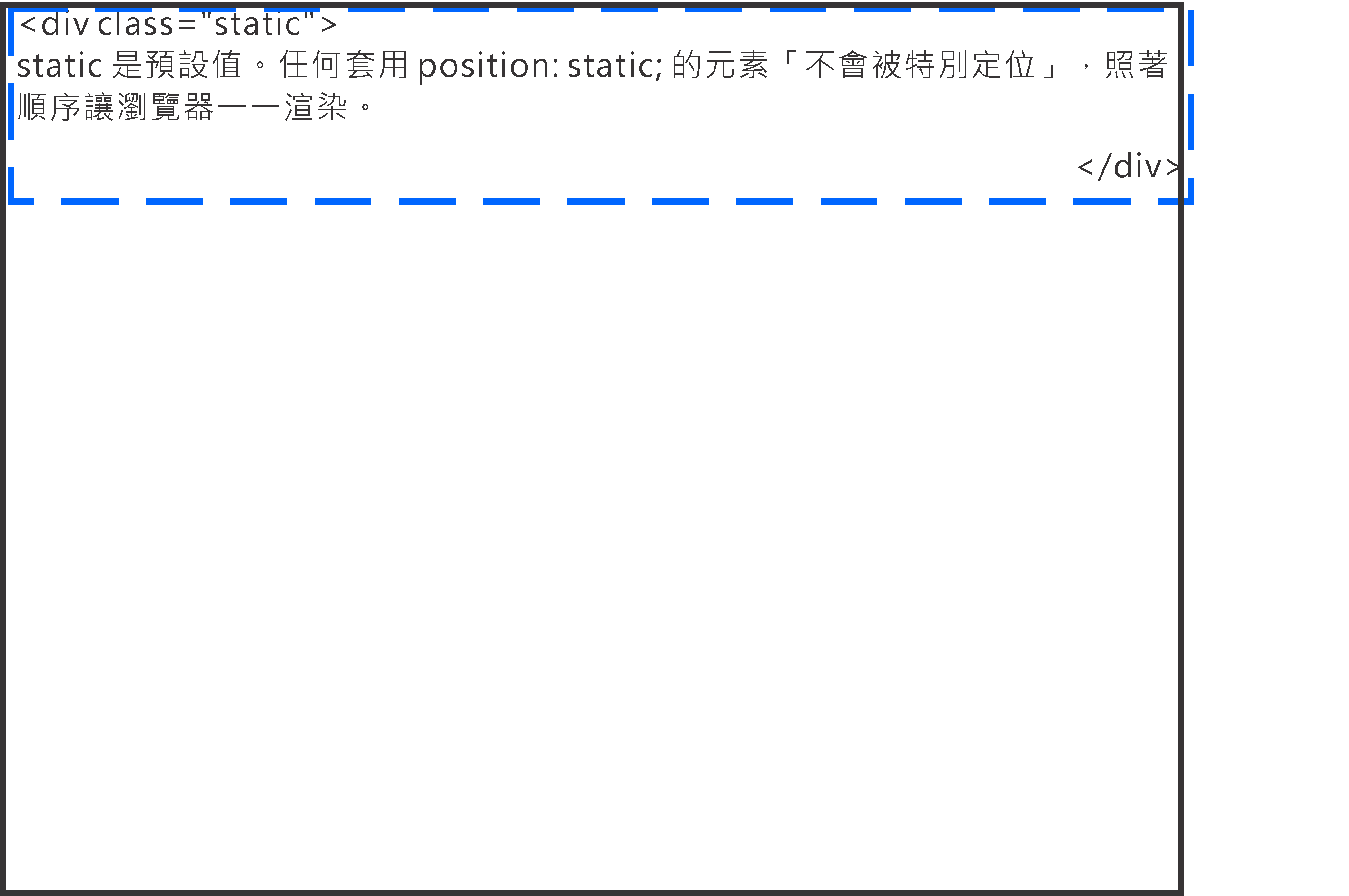
static
static 是預設的值,瀏覽器會按照正常的排版流填充元素。
/* css */
.static {
  position: static;
}
relative
relative 元素是相對於自己在排版流的位置定位的。
/* css */
.relative1 {
  position: relative;
}
.relative2 {
  position: relative;
  top: -20px;
  left: 20px;
  width: 500px;
}

fixed
fixed 是相對於 view port 定位的,所以感覺像是「固定」在畫面上。
 /* css */
.fixed {
  position: fixed;
  bottom: 50%;
  right: 50%;
  width: 200px;
}

absolute
absolute 會往父元素尋找非 static 的元素進行定位。
 /* css */
.relative {
  position: relative;
  width: 600px;
  height: 400px;
}
.absolute {
  position: absolute;
  top: 120px;
  right: 0;
  width: 300px;
  height: 200px;
}

補充 - sticky
Sticky 算是蠻潮的一個屬性,他有 relative 的功能也有 absolute 的功能。
Sticky 元素會會黏在最近的 scrolling ancestor 上。
什麼是 scrolling ancestor 呢?可以想像創造出可滾動的父層元素,像是有設定 overflow 的 elements。
知道什麼是 scrolling ancestor 之後,sticky element 的行為就是:
- 在還沒有碰到 scrolling ancestor 的時候,就像是 relative 一樣。
- 在碰到 scrolling ancestor 後,就像是 absolute 一樣,位置會固定在相對於 scrolling ancestor的絕對位置上。
下面來個範例:
<!Doctype HTML>
<head>
  <meta charset='utf-8' />
  <title>sticky</title>
  <link rel="stylesheet" href="./modal.css" />
</head>
<div class="container">
  <div class="box red">red</div>
  <div class="box green">green</div>
  <div class="box blue">blue</div>
</div>
/* css */
.container {
  overflow: scroll;
  margin: 50px;
  width: 200px;
  height: 300px;
  border: 1px solid black
}

.box {
  padding: 10px;
  margin: 0 auto;
  text-align: center;
  width: 80%;
  height: 100px;
}

.red {
  background-color: red;
}

.blue {
  background-color: blue;
  height: 300px;
}

.green {
  background-color: green;
  position: sticky;
  top: 50px;
  left: 0;
}
在一開始綠色的元素乖乖的待在排版流裏頭,但是當它的頂部距離滾動父元素 50px 的時候就「黏」住了!


![[Day 7] JS in Pipeline (7): CI/CD pipeline (2) (Fin.)](https://www.coderbridge.com/@jeanycyang/56868f16d569498aa764d3e0a63eb5a4?utm_source=coderbridge-io&utm_medium=blog_related_post_img&utm_campaign=波波的前後端隨筆_[Day 7] JS in Pipeline (7): CI/CD pipeline (2) (Fin.)_@jeanycyang_https://static.coderbridge.com/images/covers/default-post-cover-2.jpg)

_@roroiii_https://static.coderbridge.com/images/covers/default-post-cover-3.jpg)
